
Monochrome logos are available for when the blue/silver version wouldn’t have sufficient contrast. On all monochrome versions, the pyramid has a cutout that should always be on the right side (in relation to the text). There are three categories for monochromatic logos: white, black, and other.
Should only be used when printing the logo on a dark-colored background.

These logos are to be used when the primary logo won’t work due to contrast or space ratio issues. Each variant will have a possible use scenario. If you have any questions regarding additional use scenarios, contact the design team at ext.1000045.

These logos are to be used when the primary logo won’t work due to contrast or space ratio issues. Each variant will have a possible use scenario. If you have any questions regarding additional use scenarios, contact the design team at ext.1000045.

These two logo forms can and should be used in all our public collateral.


These logo forms should only be used when the public-use logos will have visibility issues with the full company name, such as apparel, etc.


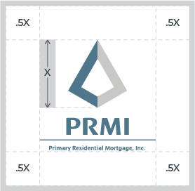
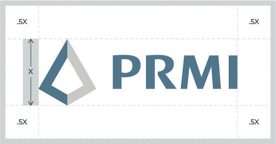
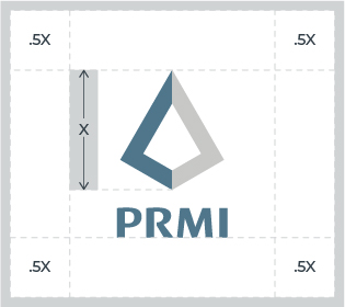
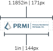
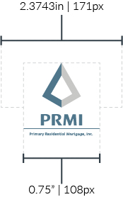

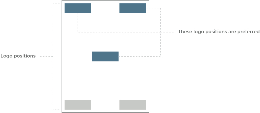
This is a guide for placing the logo on any marketing piece—digital or print. This example uses a standard letter-sized sheet of paper.
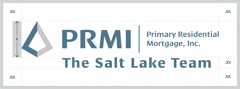
When other logos are used in conjunction with the PRMI logo, the height of the other logo(s) must not exceed the height of the PRMI pyramid (X). The spacing between logos should also correspond to the height of the PRMI pyramid (X).


Here’s a short list of prohibited logo use case scenarios. This is not an all-inclusive list. Any questions on logo use should be directed to the Marketing Design team either by phone or email. Phone: ext. 1000046; Email: [email protected]
The logo should always be used in its entirety. We’ve provided multiple variations above, but nothing should ever be omitted from a logo. In the example below the omission of the pyramid from the original design makes this logo unacceptable for use.
The logo should always be used in its original arrangement. In the example below, the logo elements are rearranged from the original design and is not authorized for use.
The logo should always be used in its original ratios. To maintain the original ratio while changing the size of a logo in an Outlook email, select the image, click and hold one of the four corners, and drag to scale proportionally. In the example below the logo has been stretched vertically and compressed horizontally from the original design and is not authorized for use.
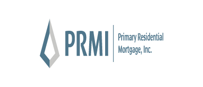
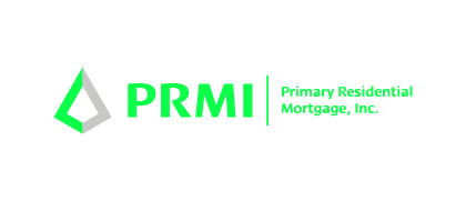
The logo should always be used in its original colors. In the example below, the logo color has been changed from the original design and makes this example unacceptable for use.
The logo should never have images or text added inside the safe area. In the example below, a heart and text have been added to the original logo within the safe area.

The logo shouldn’t have any effects applied to it (e.g., drop shadows, glow, patterns, or frames). In the example below, the logo has had a drop shadow added to the original design and is not authorized for use.

The logo should never be placed over a busy background since it will lower the visibility and legibility.
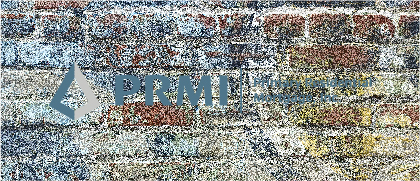
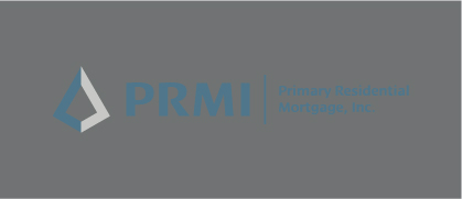
The logo should never be placed on a background that is tonally similar as this will reduce contrast and legibility.
The logo shouldn’t be used if it’s going to pixelate. If you need a larger version of the logo, contact Marketing for the proper size based on usage.
